Hey gang,
I am working on building out a few stylized studio scenes for creating a unified set of past project hero shots for the webpage.
Using an inspiration method learned from @will.gibbons, I’ve been scouring Pinterest and creating boards of studio images I quite like, but I also want to try for something unique beyond the white backdrop or loft space.
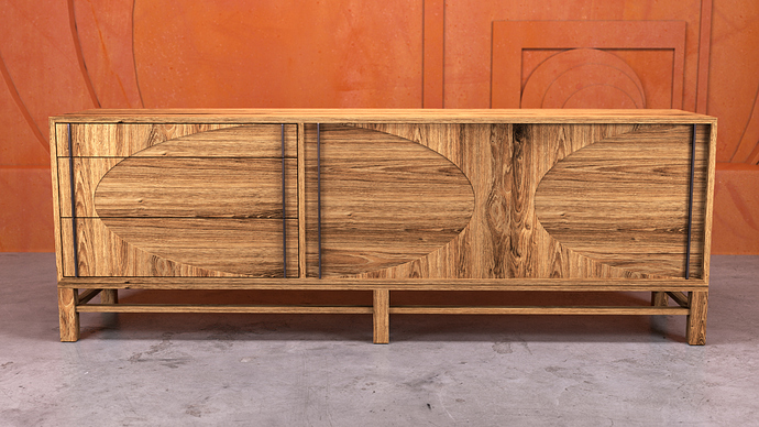
Being on a Bauhaus kick lately, this is what I came up with in a session yesterday and I wanted to do a sanity check on whether it is too distracting / detracting from the product.
Note: this orange is my company color and in this instance the credenza is the product. Also I realized too late that I needed to re-tessellate the curved parts in the background for better lines.
All critique welcomed!
Thank you,
M
2 Likes
Saturation of the background fights for spectator attention with objects on the first plane. But I like geometric relief on it.
1 Like
I like it! As well as the orange since I’m Dutch and you just have to like it else life gets hard.
But the orange can be hard if you have an object which doesn’t match the orange. Like f.e. a colder grey product wouldn’t really fit the orange background I think. If you make the back grey for example and only have your logo there somewhere subtle (guess it’'s orange as well) it wouldn’t hurt and you could use the same studio more often.
2 Likes
Lol @oscar.rottink , orange is my favorite color so I think I’ve just discovered I might be secretly Dutch!
@imauserwiththisname the credenza looks great. I would want it in my house!
1 Like
I think I lean toward agreeing with @oleksii.rybakov in that the oragne fights for my attention. I don’t mind the detail on the background. I’d just test some different colors. In the end, you want the product to shine!
1 Like
Hi gang,
I appreciate your critiques and assessments, since WFH by myself can lead to tunnel vision!
Upon further consideration, I agree that the saturation of the background can fight for spectator attention with objects on the first plane. Going to keep iterating over the weekend on the suggestion of trying other colors to keep the product the main focus and will report back.
@oscar.rottink, my grandmother, landlord, and next door neighbor are Dutch, could be why I’m so drawn to the Oranje Legioen! 
@melissa.henley, thank you! The engineering was tricky, but it’s finally headed into production!
Cheers,
M
1 Like

